I got an invite to Simple, a Portland-based startup offering that is trying to reinvent banking with new tools and services around traditional bank accounts (in this case, from Bancorp Bank).

So, a service promising SIMPLE, to me, a life-simplifier but champion non-finder of simplicity in most things! Game On!
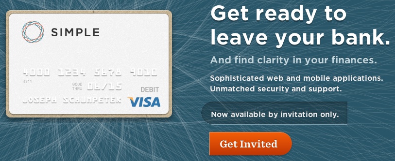
No really, I don’t want to give them a hard time. I truly support what they seem to be doing, love that they moved from Brooklyn to Portland, and think they have great design sense. I even think it’s kind of nerdy-funny that they make their example card-holder (as above) “Joseph Schumpeter,” the Austrian economist who popularized the term “creative destruction” to describe entrepreneurial capitalism.
I just offer my suggestions, in the beneficient spirit with which I offer it to many a company that wanders down my dark alley. We are always learning, together, right?!

Banking. Can it make us happy?
Opening screen:
What We Offer: mentions account, iPhone app — it isn’t clear if there is a web-based service also. Not mentioned, but then we are in a web-based signup form, so evidently at least part of the service is provided on the web. No web-based interface is a significant issue to me — almost enough to decide not to apply. A system with multiple interfaces, not tied to a single app installation, is simply more usable and higher-value to me, and it’s something I enjoy from my current bank, Chase. Which I hate in many ways, but nonetheless haven’t found a overriding case for leaving in 20 years.
Signup asks for number, then what device? This assumes a number is attached to a device. In my case, and in that of many people I know, it isn’t. I use a Google Voice number, that directs to and I use from various devices including an iPhone, laptop, and Android tablet; and my way of using an iPhone doesn’t even require that I have a number at all. That’s simpler for me, for reasons too complicated to go into here.
iPhone selection triggers note “Our app requires the latest version of iOS, so make sure you’re up to date”. Now, I’se just simple folk, and don’t know the whole get-out with this real high-tech and modern stuff, but pa always said, it probably isn’t true that at every single moment, apps work only with the latest iOS version released at that moment. There are many iOS updates, announced to varying degrees, and almost always a given app either needs some time to be updated for the new version, and/or it will be back-compatible to the prior one(s) for some time.
When I see a message “the latest version is required”, the message I get is that a service is not bothering to test or provide accurate information about its product compatibility state, and is instead throwing a complex responsibility back onto every user. I have horrible, horrible associations of required Flash players on the Web, that plague which stalked us for so many years; or of insidious Java update demands, or aggravating iPhone App Store update demands. Product updates were long, long ago hijacked by companies for self-serving commercial and marketing purposes; this is exactly the type of fraudulent nonsense that I’m dying for “simple” services to rescue me from.
Furthermore, I would ask whether and why you’d want to demand the latest iOS. There are many good reasons that people choose to or are not able to upgrade:
– broken/lost features such as maps in iOS6
– customized setups that can be broken by upgrading
– risk of losing data & configuration
– the significant time and difficulty required to upgrade
– perhaps most importantly, accelerated forced obsolescence of older devices, which at some point won’t run newest iOS. Personally I’m sporting an iPhone 3GS, which in Silicon Valley has gone from being seen as derelict, to curio, to insolence or freeganism.
A mentality of always having to have the latest equipment, and whatever updates are pushed out by device/software makers, seems exactly contrary to the brand ethos of Simple. The appeal of “Simple” is that I want to simplify my life: of exactly this sort of mandated engagement with complicated, commercially-driven intrusions on my time, attention, and budget.
Bank Transfer
is this done without a fee? No fee is mentioned, so I hope so, but it’s typical to charge a few; many users might pause here wondering that, so I would suggest clarifying.
Legal agreements
I was quite disappointed to see the click-wrap legal agreements required to apply.
The Account Agreement, for example, is 17,800 word of straight legal language. It is a farce to suggest that this is reasonable customer communication, or that any significant portion of customers could or should read this thoroughly or informedly. Such documents are written to protect a company’s interests, and they are anti-communicative to users because they bury significance amid unreadable legalese.
I suggest you work with a service to produce and design a human-readable document version, particularly pulling out any items that are points of comparison between Simple and other bank services, e.g. fees, daily withdrawal limits.
I do realize that Bancorp is likely to require its standard agreement to be binding; but the human-readable version might be clearly presented as just explanatory addendum.
If that’s too much trouble, well, that’s the sort of trouble I’m looking for Simple to undertake on my behalf, to make my life simpler. Since you lack many of the benefits of banking at say Chase, such as ubiquity of branches and complete product line, clearly you need to do better on core value propositions such as user-orientedness and complexity-reduction. Using a 17,800-word boilerplate account agreement from a traditional bank doesn’t do that.
Privacy and Marketing
The Bancorp Bank Privacy Practice agreement linked to in the Simple sign up actually seems quite bad, in that it doesn’t even offer ANY opt-out from information sharing. So by signing up for Simple, I permanently opt-in to, for example, joint marketing from Bancorp and any party it chooses to “joint market” with, or who acquires it? That seems worse than what I normally get from financial institutions.
Cookies required? who me?
I went through the whole signup, then it failed on submission. I’m guessing this was due to cookie-blocking settings in my Firefox browser. If your form requires cookies, best to check for them at the start and alert user if not on, or at least put a message saying they’ll be required. Particularly if you are going to ask for sensitive information such as bank routing info and transfer authorization, and then possibly leave user in an uncertain state as to whether application and a large financial transfer was or will be submitted.

Nonetheless, I have gone ahead and submitted my application, in significant part because I rather like the nicely-designed all-white Visa debit card (if I cover up the ugly blot of the big Visa logo at lower right, as artfully done in the product image above). Over the years, design of bank card has been a significant factor in which bank services I use and which cards I carry; because I’m, you know, particular.The full delivery kit pictured above, however, with the “IT’S A GOOD DAY” embossed wood backboard and drawstring cloth bag, does make me feel a bit like I’ve wandered onto the set of a Portlandia parody sketch, but that’s ok, I support local craft, and Portland will be Portland.
Next Steps
Installment 2 of my Simple review to follow later, as the application process / onboard process continues, and possibly they accept me.
Media inquiries: @tmccormick on Twitter.
.
.

