Why are Bibles so unreadable, to perhaps a majority of people? Possibly it is partly due to the fact that most Bibles contain an relatively huge amount of content, much higher page density, smaller type, and unfamiliar paragraph and page layout, compared to virtually any other contemporary book. I hesitate to second-guess the large and sophisticated Bible-publishing industry; but as a designer, I have to at least wonder, if Bible readership is the goal, why are readers usually being offered such unwieldy and illegible volumes to read from?
So this suggests an experiment.

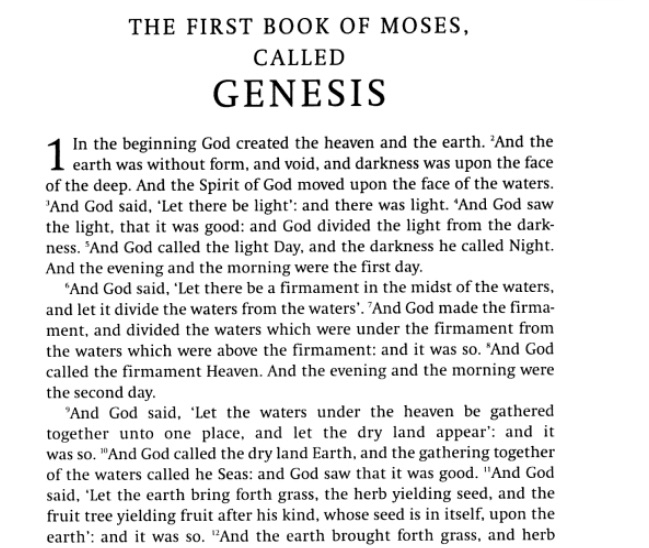
The design issues above mostly result from trying to force the entire Bible into a single, portable volume. But why the determination to do this? After all, most educated people know that what we call “the Bible” is a compendium of different writings from different times and contexts. Nonetheless, when it comes to Bible publishing, there seems to be an overwhelming preference, or call it compulsion, or perhaps economic logic, to pack it all into one volume. Thus the Bible edition — familiar to many of us from Gideon’s Bibles in hotel rooms, or the family bookshelf, etc. — with usually King James Version text, printed 2 columns per page, with each new sentence or “verse” numbered and starting on a new line.
Key design factors, for anyone seeking to increase readibility:
- choice of translation (if any);
- lineation: are sentences gathered into paragraph, or each one given a new line?
- page layout: one column or multiple;
- number of volumes: one or multiple.
In many years of looking for Bible editions in bookstores used and new, I’ve found that paragraph and single-column layouts are unusual, and multi-volume complete Bibles are quite rare (correct me on that, bibliophiles, if need be!). More to the point, I’ve simply never found the reading Bible that I want: a King James Version, paragraph single-column format, in a edition of 4-6 volumes, with readable type size and no show-through on the paper.
So, I decided to make my own.
Historical note: Bible design exerts a fascination over many book designers, quite independent of any religious or even literary interest in the text. That is because the Bible is widely considered to be the ultimate challenge in book design — and a challenge with centuries of fascinating history behind it. It’s something like the Ur-text of book design: still, the most widely printed book in the world, every year for centuries.
Ok, so, I started with Penguin’s paperback edition of the The New Cambridge Paragraph Bible (2005, edited by David Norton), below. This edition traces its lineage to the landmark 1873 Cambridge Paragraph Bible, edited by F. H. A. Scrivener. (see this good BibleDesignBlog post about CPB and other full-paragraph Bible editions).
Like the 1873 edition, it is a King James Version text, printed one column per page, and with prose sentences gathered into paragraphs (rather than each on a new, numbered line). These two reforms bring the presentation much closer to 19th / 20th Century book-design norm.
Then, I literally cut the book into sections, cutting through the spine with an X-acto knife. This produced separate book segments for front matter, back matter, and six other sections. Then I applied new wrappers (i.e. wraparound paper covers) made of 120-lb cardstock, which I pre-scored to produce flat spines of appropriate width. The front matter and back matter, I recombined into one booklet.

The end result: a King James Version Bible, in readable, paragraph, single-column layout; divided into six easy-to-handle paperbacks.
The division into volumes was my determination, but for simplicity’s sake it keeps books in the same order as the Cambridge/Penguin source volume. The volumes are:
- The Pentateuch;
- Former Prophets, Chronicles;
- Wisdom Writings;
- Latter Prophets;
- Apocrypha;
- New Testament.

At last, a Bible edition that feels much like a contemporary paperback novel (or set of novels). I happen to think there is an untapped market for an edition like this, for people like me; but again, it’s hard to believe that Zondervan and other other big Bible publishers have not already considered it carefully. If not, have your people call my people. I’ll be enjoying my beautifully readable edition.


 If this brasswork is as old as the building (1926), it’s actually quite remarkable that the Chinese “father of printing” was given the first place in this pantheon. It’s strange, however, that the screen presents his years as “954-881”, i.e. B.C., about 1900 years earlier than the real Tao Feng (aka