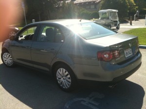
my 2010 VW Jetta. Also known as “Jettaround,” on the car-sharing service Getaround.
I have to say, going to California, Silicon Valley, new job, all important; but buying a first car: pivotal.
Although, a lot of cars seem to me quite competently designed but undistinguished, or only subtly so. Older Jettas had a more distinct, angular style, but current ones like my grey 2010 Jetta S are quite similar to a swathe of other models from Detroit, Japan, even to many more expensive cars like Benzes and those often-tame Japanese luxury sedans.
On the other hand, for me, as an honorary Brit and expert introvert, avoiding distinction and statement is a key criteria. Self-expression via my car? That, for me, veers perilously close to arriviste, even gauche.
Volkwagen was originally called the KdF-Wagen” (German: Kraft durch Freude – “strength through joy”)
Therefore, subtle elements like brand penumbra, history, personal association, and detailing matter a lot. This is why, for all that this depends on great engineers, marketers are in the drivers seat. In the developed world now, cars are so ubiquitous, so generally well-engineered and based on extremely mature core technologies — are so functionally equivalent for most people — that, I think, most money over $10,000 that anyone spends on a new car is almost purely to be won by marketing and identity. Subtle and repressed identity, perhaps masked by practical sentiments (“we need it for the kids”… “safety and reliability are key features to me”…) but identity nonetheless.
If you also consider the evidence showing that most people buy cars soon after deciding to enter the market, with very little research, then you realize that cars, while being high engineering at base, are in fact mainly a huge and lucrative field of identity expression. In fact, the more the brand talks about engineering (BMW, e.g.), the more it’s likely to be about identity.
Taking me, for example, let’s take a tour of that fertile field the marketers, not the engineers, have to plough. My father once owned a Model A Ford, which along with the Model T was the American “people’s car” designed to be affordable to all workers. This was precisely the same goal of the (*cough* Nazi) German Labour Front, starting in 1937, for what was originally called the KdF-Wagen” (German: Kraft durch Freude – “strength through joy” — the name of the giant state-controlled leisure organization in Nazi Germany) and then Volkswagen, “people’s car” (a term used in Germany as far back as the 1920s).
When the VW operation was about to be dismantled after WWII under the “pastoralization” policy, pre-Marshall Plan, VW was saved by an enterprising British Army overseer who arranged to start selling VW trucks to the occupying forces and the German postal service. Some returning UK soldiers were allowed to bring their VW Beetles back to England after the war, thus seeding the market.
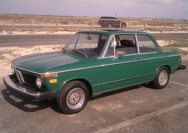
BMW 2002 (produced 1968-76), dark green like our one
My father subsequently owned a Beetle, and my parents a VW hatchback, and further on the German front, in England I grew up riding around in our BMW 2002. (a practical and best-selling car, now considered one of the most classic and collectible of all BMWs).
All this no doubt is part of why I tend to like German cars. For a design and book devotee like me, Germany is also importantly the homeland of Gutenberg, the Bauhaus and Modern design/typography, and the Frankfurt Book Fair. So too, I’m pleased to learn — as an aspiring trans-Atlantic type, and dual U.S. / E.U. citizen — that the name “Jetta” comes from the German term for the Atlantic jet stream, as in the “winds of freedom blow” (Martin Luther’s Die Luft der Freiheit weht, Stanford’s motto) between Europe and America.
It can’t hurt, either, that Volkswagen group also includes Audi, Porsche, and Lamborghini, some of my favorite other marqees. (if I were the type to reach, as the British say condemningly, I might even say that I think of my Jetta as really an entry-level Audi. In sheep’s clothing — or more sheepish clothing, as the case may be). Bearing in mind that in my new environs of Silicon Valley, a nearly-new Jetta (which I think of as fabulous, unimaginable and nearly embarrassing luxury, any moment to be found out, confiscated, and me thrown back in jail) — here counts as practically a junker, a just-out-of-college throwaway car, or something you drive to impress upon your investors that you’re truly a bare bones, “skin-in-the-game” startup type. A 2010 Jetta is far cheaper than the average car on the road here, as my insurance agent told me, with a sympathetic and perhaps pitying nod, while selling me collision insurance.
 The Volkswagen campaign for my sentiments really took off in the 1950s, however, when VW began its extraordinary run of game-changing, highly effective counter-cultural U.S. marketing, with the print campaigns designed by Doyle Dane Burnbach.
The 1959 Think Small series of advertisements, a famous example of which is at left, were revolutionary for their compelling graphic modesty, counter-intuitive message, and sometimes leaving off brand, logo, and product description entirely. It was voted the No. 1 campaign of all time in Advertising Age‘s 1999 The Century of Advertising.[3

Apple “Think different” ads
Never mind that a 2010 Jetta is hardly small by world standards, and if you look at it in the context of the whole VW range you see it’s a “family sedan”, far up the list above the smaller-footprint categories of City Car, Super Mini, Mini, small sedan, etc. Volkswagen reached out to those uncomfortable with “Big” America, chafing at that Whitman-esque “barbaric yawp” and raw power, and invited us in to the Think clubhouse. (connecting to the original IBM “Think” slogan dating from the 1910s, but even more importantly, to Apple’s later “Think different,” which derived from “Think small” all the way down to the lower-case capitalization of “different”). VW was a pre-Steve Jobs version of Apple.

VW “VDub” parody ad, 2006 – click to play
A more recent example of counter-cultural marketing by Volkswagen that totally worked for me is their VDub advertising campaign from 2006, three TV ads parodying MTV’s auto show Pimp My Ride, such as Episode 1, “Wrecking Ball.” Each stars an effete German engineer named Wolfgang, and German model Zonja Wöstendiek as his assistant Miss Helga, who mock the hip-hop wannabees’ absurdly vain hot-rods, and gleefully destroy them, to introduce a gleaming and trim VW GTI. Awesome! Those pimp-my-ride jerks who used to push us around on the playground, now we get to destroy their wide-boy blaring-exhaust tail-finned customized abominations!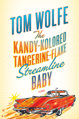 (those which Tom Wolfe satirized in his landmark 1963 Esquire “New Journalism” essay, “There Goes (Varoom! Varoom!) That Kandy-Kolored (Thphhhhhh!) Tangerine-Flake Streamline Baby (Rahghhh!) Around the Bend (Brummmmmmmmmmmmmmm)…”, title essay of The Kandy-Kolored Tangerine-Flake Streamline Baby).
But counter-cultural politics aside, the true ace-in-the-hole and deal-clincher for the 2010 Jetta, its Unique Selling Proposition (thank you, friends in Marketing) is, for sure, the hubcap typography.
VW was already way out ahead with its general logo, which cleverly stacks the V and W into a the type of old-style center-crossed “W” beloved to typography buffs everywhere, and joins the power of a circle to dynamic zagging diagonals. (Benz, the trinity? Lexus? yawn..). Note the center-crossed “W” in the icon of one of our most potent New Economy symbols, Wikipedia:


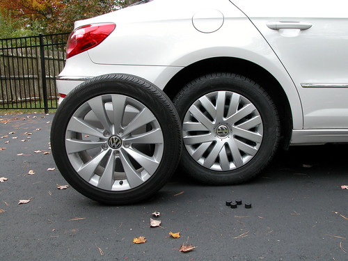
2010 Jetta hubcaps (right): win for best typography
Now notice the play of “V”s and “W”s contained in the hubcap specific to (as far as I’ve seen) the 2010 Jetta, at left. Genius. Natural. Totally unnnoted by most people, but also highly distinctive when you finally see it. (like me! I’m just kidding. That’s just what what most people feel).
In sum, I may be a shameless capitalist tool and a pawn of advertising masterminds. But, so far as I could see, in the brief time I had to research my purchase, there were a dozen manufacturers out there in a fiercely competitive market, making quite well-designed, quite similar cars at a similar price, similar fuel economy and safety rating etc, using highly mature technologies. Time is short, research is hard, they all seem satisfactory. What am I going to do? I’m going to enjoy myself by swimming in the fertile sea of emotional / cultural associations around cars, because that’s what I’m really buying, not a car itself — that’s the real value in it for me. I’m going make some little statement, subtle — but for me all-important — about the Model A Ford that was my father’s first car, and the value I place on, say, good typography.
——–
Addendum (1/15/12 9pm):
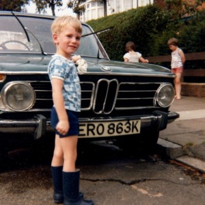
My father observes that, not only did I ride around in that BMW 2002 when growing up, but I worked hard and lovingly to maintain it, as shown in this picture he sent, from circa 1979.

My two sisters, on the other hand, the soul of indifference as seen in background skipping rope or something, now drive a Subaru and a Toyota. Coincidence? I don’t think so.
The point is, parents, you have a solemn responsibility: instill good brand preferences in your children by age five, or it could be game over.
Thanks pops. Super Dad and, clearly, German auto industry brand ambassador #1.
Comments? email tim (at) tjm.org, or Twitter @mccormicktim. Due to spam problems, comments entered below will be delayed for approval.


 (those which Tom Wolfe satirized in his landmark 1963 Esquire “New Journalism” essay, “There Goes (Varoom! Varoom!) That Kandy-Kolored (Thphhhhhh!) Tangerine-Flake Streamline Baby (Rahghhh!) Around the Bend (Brummmmmmmmmmmmmmm)…”, title essay of
