1932 radio in the shape of books

1932 RCA Victor radio, designed to look like a row of books with bookends. Nice example of a new technology imitating an older one — like early radio and television imitating theater.

What I wonder is, did the makers or the buyers of this radio expect it would deceive anyone?  After all, you don’t have to see it very closely to realize it’s a radio.  Unless, perhaps, you had never seen a portable radio set.  I think the concept was that some portion of buyers would want a radio that would blend in to their parlor, with its books.  Or perhaps a book-less parlor would be dignified by these false books.

Easy-read Bible: divided into six paperbacks

Why are Bibles so unreadable, to perhaps a majority of people?  Possibly it is partly due to the fact that most Bibles contain an relatively huge amount of content, much higher page density, smaller type, and unfamiliar paragraph and page layout, compared to virtually any other contemporary book. I hesitate to second-guess the large and sophisticated Bible-publishing industry; but as a designer, I have to at least wonder, if Bible readership is the goal, why are readers usually being offered such unwieldy and illegible volumes to read from?

So this suggests an experiment.

The design issues above mostly result from trying to force the entire Bible into a single, portable volume. But why the determination to do this? After all, most educated people know that what we call “the Bible” is a compendium of different writings from different times and contexts. Nonetheless, when it comes to Bible publishing, there seems to be an overwhelming preference, or call it compulsion, or perhaps economic logic, to pack it all into one volume. Thus the Bible edition — familiar to many of us from Gideon’s Bibles in hotel rooms, or the family bookshelf, etc. — with usually King James Version text, printed 2 columns per page, with each new sentence or “verse” numbered and starting on a new line.

Key design factors, for anyone seeking to increase readibility:

  1. choice of translation (if any);
  2. lineation: are sentences gathered into paragraph, or each one given a new line?  
  3. page layout: one column or multiple;
  4. number of volumes: one or multiple.

In many years of looking for Bible editions in bookstores used and new, I’ve found that paragraph and single-column layouts are unusual, and multi-volume complete Bibles are quite rare (correct me on that, bibliophiles, if need be!). More to the point, I’ve simply never found the reading Bible that I want: a King James Version, paragraph single-column format, in a edition of 4-6 volumes, with readable type size and no show-through on the paper.

So, I decided to make my own.

Historical note: Bible design exerts a fascination over many book designers, quite independent of any religious or even literary interest in the text. That is because the Bible is widely considered to be the ultimate challenge in book design — and a challenge with centuries of fascinating history behind it. It’s something like the Ur-text of book design: still, the most widely printed book in the world, every year for centuries.

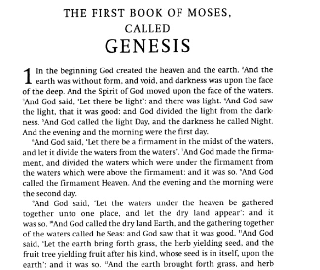
Ok, so, I started with Penguin’s paperback edition of the The New Cambridge Paragraph Bible (2005, edited by David Norton), below. This edition traces its lineage to the landmark 1873 Cambridge Paragraph Bible, edited by F. H. A. Scrivener. (see this good BibleDesignBlog post about CPB and other full-paragraph Bible editions).

Like the 1873 edition, it is a King James Version text, printed one column per page, and with prose sentences gathered into paragraphs (rather than each on a new, numbered line). These two reforms bring the presentation much closer to 19th / 20th Century book-design norm.

The_Bible__Penguin_Classics___Anonymous__David_Norton__9780141441511__Amazon_com__Books

Then, I literally cut the book into sections, cutting through the spine with an X-acto knife.  This produced separate book segments for front matter, back matter, and six other sections. Then I applied new wrappers (i.e. wraparound paper covers) made of 120-lb cardstock, which I pre-scored to produce flat spines of appropriate width.   The front matter and back matter, I recombined into one booklet.

The end result:  a King James Version Bible, in readable, paragraph, single-column layout; divided into six easy-to-handle paperbacks.

The division into volumes was my determination, but for simplicity’s sake it keeps books in the same order as the Cambridge/Penguin source volume.  The volumes are:

  1. The Pentateuch;
  2. Former Prophets, Chronicles;
  3. Wisdom Writings;
  4. Latter Prophets;
  5. Apocrypha;
  6. New Testament.

At last, a Bible edition that feels much like a contemporary paperback novel (or set of novels). I happen to think there is an untapped market for an edition like this, for people like me; but again, it’s hard to believe that Zondervan and other other big Bible publishers have not already considered it carefully. If not, have your people call my people. I’ll be enjoying my beautifully readable edition.

Secrets in the facade of Univ. Washington’s library

The rich iconography in the facade of University of Washington’s main Suzzallo Library has been well-noted by commentators.  For example, in the Wikipedia entry for the library, or in the architecture guide by Norman J. Johnston published in Princeton Architectural Press’ “Campus Guides” series.

The guides I’ve seen all mention the 24 sculptures of famous cultural figures, set on the outside faces of the building’s buttresses.  Several also note the three figures set over the main entrance, by the same sculptor as the buttress figures, representing Thought, Inspiration, and Mastery.  However, the 24 figures are far up, hardly visible from the ground;  and the three big figures are not visibly labeled  (that may be why Johnston gets them mixed up in his commentary).

Strangely, I can’t find mention of the inscriptions which are easily the most visible to any person actually entering the library:  the brasswork directly over the six doors, representing six famous figures in printing and publishing: Tao Feng, Gutenberg, Caxton, Aldus, Estienne, and Elsevier.

If this brasswork is as old as the building (1926), it’s actually quite remarkable that the Chinese “father of printing” was given the first place in this pantheon.  It’s strange, however, that the screen presents his years as “954-881”, i.e. B.C., about 1900 years earlier than the real Tao Feng (aka Feng Dao), whose years are the reverse, 881-954.  The Chinese are ancient, yes, but not always that ancient.  (and once again, I feel like I’m the only guy who ever studies these plaques).

Above the fourth door, centermost of the “in” doors, the inscription reads “Aldus”, for the famous Venetian printing and publisher Aldus Manutius.  I wonder if this placement had any part in the naming of Seattle-based Aldus Corporation, whose creation of Pagemaker software started the “desktop publishing” revolution.

Speculation aside, I think the position of these six printer/publisher names, directly above the doors, is poetically apt.  Further above is Thought, and Inspiration;  and far above that, the pantheon of Moses, Dante, Adam Smith, etc.;  but usually the main pathway to Learning is by books and printing, represented by these printing/publishing figures which make up almost literally part of the door into the library.  Intentional or not, the positioning of this group expresses a fundamental truth about learning.

more photographs of Suzzallo library.

Social Networks for fun and profit: the “river system” model

Facebook-logoSo you’re determined to make use of this online social network phenomenon, which is apparently now how jobs are filled, companies are started, the social “A” list determined, and so on. Good. What to do? Well, a main part of it is to make your online activities visible to the right people, in the right way. To think about this, I propose an analogy of a river system.

What? Ok, so in general, a person using social networks has some set of activities and communications which she wishes to convey to certain audiences, possibly to the world. But not all of your audiences want to get all of your news.

Perhaps this is stating the obvious. But half the people I talk to, if social networks come up, profess total incomprehension, and often dismay, fear, and paranoia. So this is for you.

My key, if not earth-shattering, idea, is that various audiences want progressively more filtered versions of your personal newsfeed. But there is probably a core stream, such as your personal or professional blog, that is occasional and newsworthy enough for everyone to tolerate.  Think of that core stream as the headwaters of your river — clear, pure wisdom, up in the mountains.

Now the river flows along, and other tributaries enter into it, and the river gets wider.  This is like your news stream being joined by new data, such as postings about your new photographs, or notices from your book-collecting service about your new acquisitions (I’m cutting back, I promise!), etc.  Well, various audiences downstream are OK with drinking from the bigger river, because well, the river is bigger and they want more of your water.

What do you think?  Is your social networking like this, or is everything in one flood, or do you have multiple rivers?

Here’s the diagram illustrating the model.  Click on the image to see a full-size version.

Social-Network-Communications_Tributary-diagram1b

First realizations from grad school

I’m realizing a few things from starting grad courses recently.

First, study skills, what? My study skills and study time management were solid in high school, eroded in college, and subsequently went into exile on a distant planet, or maybe a black hole. Come back, please!

For some reason the same is largely true of my home decor sense. I used to be able to put pictures on the wall and maintain a usable couch, but no more. My cats live and scratch in happy freedom. All evolves downward to the cats’ preferred level of entropy, while humans stay away.

But back to grad school: secondly, I see that current and recent undergraduates now appear to me to be about thirteen years old, from my grizzled and wizened, if not exactly wiser, vantage. Youth, what happened?

the future of the book, and the sorrows of Web video

Bob Stein at if:book blog (Institute for the Future of the Book) points to the recent vision-of-the-future video from French publisher Editis.   He remarks, “this film loads very very slowly but i think it’s the most exciting vision of the book of the future since Apple’s Knowledge Navigator in  1987.”

In the 9-minute video, we get mouth-watering, partly tongue-in-cheek scenes of continental Europe’s quality-of-life — fantastic trains & pedestrian streetscapes,independent bookstores, delicious food, world-class museums, weekend getaway to Bruges, etc.– as the movie follows a couple through a riotous few days of E-book high living.

On their fabulously svelte, Kindle 2-like devices, they

  • read and purchase novels
  • enjoy reading on the beach
  • get multimedia museum guides
  • navigate foreign cities with ease
  • stay in multimedia contact with friends and family
  • collaborate with colleagues on shared virtual desktops while at sidewalk cafes
  • see many hi-resolution Breughel paintings online and off that I’m dying to see myself
  • etc.

It’s great stuff.  I couldn’t help but be struck, however, by the sheer badness of my user experience in trying to watch this video.  On my cable-modem connection at home — which costs an an exorbitant sum, by present-day French broadband standards — the nine minutes of video stopped and started across 30 minutes of my viewing time, such that before long I shifted focus to another task and was just glancing over at the video pane now and then when a few new seconds deigned to arrive.

Of course, we can say that my connection is bad, and maybe my online-backup process is conflicting, and maybe Time Warner Cable has limitations on sites starting with “e”, and maybe the demand for the video is really high at this particular hour, the host is rationing access, yadda yadda.

The thing is, though, my connection isn’t really bad, it’s normal to good.  It’s video-capable in the last-mile, for sure;  but across large Internet distances it’s subject to many latency delays like almost everything is.

What’s really bad is that it a purportedly state-of-the-art Web video presentation would be implemented as a stream only, quite possibly streaming from a French host directly to me.  This is sheer madness from the standpoint of user experience. (admittedly, I didn’t look into it very far to see if alternate presentations are possible. But I’m channeling past experience with other video clips here).

Even if the host has limited bandwidth (not likely —  Editis is one of Europe’s biggest publishing companies), the last thing you want to do is force a viewer to sit through the stuttering, piecemeal delivery that results.  Please make the file downloadable, so the viewer can watch it undistracted when and only when it’s all there. Or distribute it to Youtube, Bittorrent, and/or other scaleable infrastructures. If there were a best-practices  `”pattern language” for how to do web video, this would probably be among the first entries.

The deeper point is that, technology aside, I myself am the cause of all sorts of interruptions: like, the kettle boiling, an urgent or more interesting message appearing, deciding to go walk the dog, etc.  The video download should no more presume my continuous full attention than it should assume continuous full bandwidth.

You could also say, life is mostly not full-attention. Social interaction, or walking down a street, or browsing a market, or working in an office, is a full-blown constant negotiation of many communication channels and actors.

Full attention is a peculiar condition, of certain occasions such as religious ritual, theater and film stagings and screening, of interpersonal intimacy, of deep pleasure reading or intensive study.

The Editis video addresses this reality beautifully, in my opinion, precisely by showing their e-book device embedded effortlessly in so many different real-world scenarios of the main characters.  It isn’t a thing-in-itself, in a demo setting.  The Editis video stresses, as did computer visionary Douglas Engelbart decades ago, how the technology is valuable because it augments our lives and intelligence, rather than displacing it or delivering something purportedly all new.

Without this being the baseline vision, we are in the land of tech fetish objects worshipped by early adopters, with the rest of us unserved or subservient.