Oblique Strategies and creativity – Brian Eno

Brian Eno interviewed on BBC about creative strategy and Oblique Strategies

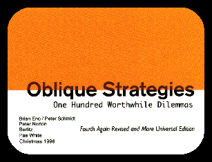
Oblique Strategies (subtitled “over one hundred worthwhile dilemmas”) is a set of published cards created by Brian Eno and Peter Schmidt first published in 1975.

Each card contains a phrase or cryptic remark which can be used to break a deadlock or dilemma situation.  Examples include:

  • Honour thy error as a hidden intention.
  • Look at the order in which you do things
  • Work at a different speed
  • Look closely at the most embarrassing details and amplify
  • Not building a wall; making a brick
  • Repetition is a form of change
  • Don’t break the silence
  • What wouldn’t you do?
  • What are you really thinking about just now? Incorporate
  • Disciplined self-indulgence

“It’s kind of art school stuff, turned into a lifestyle really.”  Eno comments.

Random Oblique Strategies (gives you 1 at a time, from OS vols 1-5):

See also the idea of “Lateral thinking” from Edward De Bono, 1970:

Gifting, Wrapping, Tweeting, and (Hand-) Writing

I love the rituals of unwrapping and the nuances of packaging.  How others unwrap, you partly orchestrate by how you wrap.  I’ve found there are many categories of gift unwrapper to keep in mind:

  1. the person made nervous and hesitant by any wrapping that is at all fancy, particularly any nice paper;  typical exclamation, “I don’t want to tear this paper, it’s so nice!”  Unfortunately, you’ve injected anxiety into her gift experience, where it shouldn’t be.
  2. the meticulous unwrapper, who seeks to avoid all rips and who carefully removes tape from paper, torturing the less patient people around her.
  3. the ripper, who just takes the shortest path to the goal, and tosses the paper aside as garbage;  and
  4. the keeper, who always wraps the gift back up in the wrapper, and keeps the gift together with wrapper.

Because of unwrapper #1, the nervous, I now try to wrap presents tapelessly just as I used to, but secured with a single, visually prominent sticker.  This provides the unwrapper with a signpost to how to unwrap, relieving unwrap anxiety.  Also, for unwrapper #3, the ripper, the sticker provides a single obvious place to rip – because even the rippers are to be accommodated, by the gracious giver.

I got the tip about the sticker from the gift wrappers at a stationery store I visited in Tokyo, who would do in seconds these ultra-neat diagonal wraparound wrappings, seemingly with just a few graceful movements, and they would seal each one with a small round sticker emblazoned with the store emblem and name.  Nice touch.

It’s also for the sake of unwrapper #4, the keeper, that I try to wrap without tape or glue and perhaps just a sticker, so the present can be opened just by unfolding the wrapping, and likewise can be re-wrapped by folding it up.  Done right, there is a pleasant sense of congruence as the folds easily return to their closed form.

It goes to show, people have quite different attitudes towards the wrapping of presents – now how about the broader rituals surrounding gifts?  In Chinese culture, for example, traditionally it is common to three times decline, and then not open a present when in the presence of the giver;  you should neither open a gift there-and-then unless repeatedly urged to, nor should you be be surprised if your host just puts your gift aside.  In such a context, I once gave my [Chinese] host a meeting gift, i.e. gift upon first meeting someone (which I consider to be a charming practice, even if it’s dying out in China), and I was surprised when she immediately turned around and left the room, then came back a few minutes later without the gift, and didn’t mention it further.

Because all this social practice baffles me, I’ve naturally turned to a book — The Gift, by Marcel Mauss, an anthropological and sociological study of mostly ancient gift practices, such as potlatch, (an occurrence, incidentally, in many societies and not just the well-known Northwest Indian case).  Mauss makes the point that in most known ancient or aboriginal cultures, gift-giving was a primary economic activity, and the main way that goods were ‘traded’; and gift-giving was governed by a complex code of  mandatory reciprocation, through which the society’s internal and external relations were articulated.

I’m not sure quite what to do with Mauss’ point, yet.  On the one hand, it sounds quite nice, that when you give a gift, the recipient will either be certain to reciprocate, or will be beheaded. But on the other hand it could be a bit tiring, as it is said to often be for the Japanese, who for example have to manage to get their New Year’s cards to superiors delivered on precisely January 1, or give insult and incur shame.  But generally, I don’t know whether to think I should strive only for well-reciprocated gift-giving and card/letter-sending, and consider the other cases to be broken social scenes.  Or, should one accept that people are just various, like the gift-wrapping keepers and rippers, and they might or might not respond to gifts, and therefore the gracious gift-giver or letter-writer should just give — in our current meaning of the term, i.e. give freely, which Mauss suggests is an ill-conceived, latter-day practice.

This is why, despite giving it a lot of thought, it’s remarkably hard to be a good gift-giver or correspondent.  Murky boundaries need to be sensitively tested, reciprocity built up delicately.  What if you write someone an old-style paper letter, and they reply to you with Twitter Direct Message — 140-character limit in either direction, not archived, erasable at any time by either party?   Rather a poor showing, one feels, but, I suppose you have to calibrate your exchange to the level that mutually works, even if you were hoping to be something more than friends, so to speak.

All this is a sign of how dramatically correspondence has evolved in our time.  There is the movement towards public exchange, where people talk directly to friends via the mechanism of public comments on a Facebook wall, or other social-network equivalent.   There is the deliberate self-constraining, of choosing to communicate in tiny bursts via Twitter or Twitter Direct Message;  there is the complex way that twittering weaves together links, follower lists, subject tags, such that the overall system builds great complexity out of very simple posts.   Finally, there is the slow death of paper correspondence:  the other day I overheard someone waiting for an elevator, saying, yeah, she’s still sending Christmas cards, but that whole practice will die off in a couple of years.  The movement of correspondence into online forms is like the movement of advertising dollars into online:  the big increases there come at the expense of ad spending in other media, which face a steady and sad decline.   As people habituate to Twitter and Facebook, for example, quite likely their ability or inclination to write a handwritten letter, or possibly even a letter-length email, erodes inexorably.

A happy although here is that, precisely as paper correspondence becomes rarer, it becomes more expressive and valued as a classy, considered, distinctive touch.  There will probably always be executives, lovers, nostalgists, esotericists, authors, and digital malcontents who will gravitate to the ancient, permanent medium of quality paper, pen (preferably fountain pen), and ink (a thousand colors, available in those lovely old glass bottles).  Part of the draw for many is that such communications could conceivably last for centuries;  when people look back upon our “digital dark age”, from which most information is lost due to obsolescence of media and electronic formats, the once-esoteric paper media may be the main record.  Revenge of the obscurantists, of those who gift their paper letters to the future!   Perhaps the future will reciprocate your offering, even if your current correspondents don’t.

On Becoming a Facebook Ghost

You’ve probably seen the recent, widely-distributed alert about how Facebook’s News Feed (wall) changed:  now it shows you updates only from friends & pages you’ve interacted with recently.

So, possibly a huge portion of the daily connections between FB users has been quietly suppressed, to achieve this greater focus.  A lot of my network, perhaps, has gone silent, and I’m now invisible to many of my “friends,” but I don’t know which.

It is like you are walking around in public, and many of the people you see are actually ghosts, holograms, but you don’t know which.  If you greet people or tap them on the shoulder, often they don’t respond, and you don’t know if they’re just indifferent or they’re just ghosts.  (ok, years of living in NYC talking here).

You can change your wall settings back to how they were, so *you* see all your friends’ news.  (see how, at bottom of post).  But you’ll may still be invisible to them, unless they changed *their* settings.  And it’s a well-known principle in software design that most people never change default settings.

Of course, this recent change just implements en masse what could happen before by people turning off or dialing down updates from specific people.  Some friend was annoying and prolific in posting, so you clicked on “less from this person”.  Thus you could disconnect from people, without their knowing.  We never really knew to whom we were ghosts.

Naturally, all this leads to the question:  how *could* I figure out who’s just become a ghost to me, and to whom I’m a ghost?  For the former, you could go through your friends list, go to their profiles, look at their recent postings/news (if any), and compare to your news feed.  (Yeah, not really feasible).

To figure out to whom you’ve become a ghost, I suppose you could post on your wall, then write to all your friends and see if they saw it on their wall;  or you could ask all of them to change their settings to show all.  Right… you’d annoy a lot of people, most wouldn’t respond, and you wouldn’t know who’d actually changed their settings in response.  Besides, if 25% of FB users wrote to all their friends, you’d get an average of 40 messages, which would be 20 billion messages total, and FB would probably go down in flames.

I’m not a Facebook expert, so perhaps one of my better-versed friends can clue me in here to some better solution, a clever FB app perhaps… anyone?  anyone out there?

It goes to show, Facebook has an awesome power to unilaterally, perhaps silently  change our new social structures, our social identities — we 500 million worldwide active users, 50% logging in on any given day.  Godlike.  Seeing our every move, even guiding which moves we’ll know, or choose to take.  And that data, practically infinite data, flowing ever inwards:  has there ever been a greater project of social observation (or surveillance) and precise social engineering?

But this experiment is one-way:  we behave, they observe.  To a large degree, they engineer this “public” realm, and we inhabit it.  They are all-seeing, and we are ghosts among ghosts.

* “Facebook has changed its News Feed, so that by default, you can only see updates from people you’ve recently interacted with! To change this, click on the arrow next to ‘Most Recent’, then ‘Edit Options’, and check the box to receive updates from ALL Friends! Then save. “

Reading Japanese Candy, and 9/11

Japanese candy wrapper flies plane into World Trade Center again.  Here’s a wrapper (unfolded) for a pack of Japanese Morinaga-brand “Hi-chew” candy.

and here it is again, with the center frame highlighted:

Looking closer at the center panels, we can see that the backdrop is clearly lower Manhattan, with the Bank of New York at left (and the Woolworth Building in the third panel).  Then there’s the strip of text flying by, led by what might be read as a passenger jet on its side, flying past (or into) a building that looks a lot like the Twin Towers of the former WTC.

What happened?  Total accident, possible sly joke?  Who knows?  In a world globalized and overflowing with image, there is plenty of graphic collision, and it can be hard to say what means what to whom.

The flavor of this Hi-chew pack, however, is “American Cherry”, which may explain things. I imagine some beleaguered graphic designers, deep in a sub-basement of the headquarters of candy-making behemoth Morinaga Seika Kabushiki-gaisha, needing to come up with a design for the next day, and casting about for something recognizably American, that they could find usable images of easily.

I imagine this possibility because New York City is a powerful, global brand — symbol that for many people is almost one with the United States.  It is a tremendous asset for New York, except for making the city a prime terrorist target.  Many New Yorkers, of course, being rather alienated from the country, might find it strange that foreigners regard the city as synonymous with the nation.

Thus perhaps the lower-Manhattan imagery.  The plane?  Well that’s the plane with the product slogan text trailing behind it that we  put on every package design! (I imagine them saying).  Here the worlds collide.

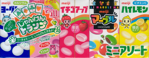
I also recently picked up an assortment pack of Meiji-brand candies:

I buy one of these now and then, I admit, because it has great fun value:  seeing the cacaphony of boxes lined up in one package;  cracking the outer cellophane to let the different jewel-like, matchbox-sized boxes spill out, each cellophane wrapped as well, and with playing-card markings on back so you could play cards if you collected enough of them.

By the time you go through the individual-box cellophane, open the cardboard box, and have one of the tiny intense candies, it is as if you are eating pure colors or images.  Yes they are for children, but I like to think it may also help one understand the pleasure Japanese have with packaging.  Also I like the candy.  Their world and my world, we meet here.

How to construct a Chinese lattice screen using the letters of your name

At the recent International Contemporary Furniture Fair, my favorite item was not any of the high-priced furniture and decor items, but an ingenious student project.  It was featured in the Designboom Mart, sponsored by global design organization Designboom, in which winners of an international student design competition offered their low-priced items for sale.

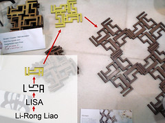
The project I loved was “IScreen” by Li-Rong “Lisa” Liao from Taiwan, a student in the graduate Industrial Design program at Pratt Institute in New York. (portfolio, personal site).    IScreen is a system for making a modular, tradition-Chinese-style lattice screen, based purely on the abstracted characters of her English name, “LISA”.   Four or eight of these modules can be combined in a ring to form a larger module;  these larger modules can in turn be combined into a larger unit, and this can be extended arbitrarily to form a large screen or wall decoration.  For a visual explanation, see the image below; click here or below to see full-sized explanation.  There is also a good explanation on Li-Rong’s web site.

A detail I found interesting is that Li-Rong used her adopted English-language name (i.e. Latin characters), to form a screen which has a clear affinity to traditional Chinese lattice-work.  As I note in the image below, the screen is produced by a series of transformations beginning with the substitution of her given Chinese name into Latin characters and a Western name, “Lisa”, and then the subsequent geometric treatments.   What does this suggest, that the relatively abstract Latin characters have a universality?  (after all, Romanizations or phoneticizations of Chinese have been proposed for centuries, and it is claimed Mao Zedong believed latin characters would replace Chinese).

[continued after the picture]

anyway, congratulations Li-Rong (Lisa) — beautiful beautiful work!  See her portfolio and her personal site for more, and ask her about buying a set of IScreens units for your home or workplace or as great gifts, for a screen or a wall decorations or as coasters.  At the Designboom Mart, she was selling them for $6 apiece, for very nicely finished, laser-cut wood pieces.

And now back to me.

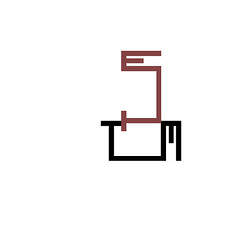
I noted on Li-Rong’s personal site that “In the future, users can go on line and order customized screens with unique graphics made from their desired characters.”   Now that was a thought I wasn’t going to let rest.  So I decided to work out a lattice system using my name “T I M”, using a core pattern abstracted from Li-Rong’s (or so I thought….see below).

So, here’s the series of transformations leading from my name to an arbitrarily extensible screen.  You can watch it as a slideshow on Flickr, or see the images below.

now add the “I” as a horizontal element connecting “T” and “M”:

now take that unit, rotate 90 degrees counter-clockwise, and attach at top:

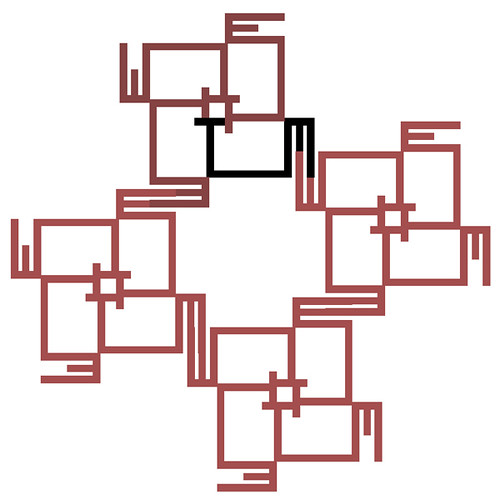
repeat that move twice more, and now we have the module below.  Let’s call it the “4 Module”.

The “M” characters form nice connectors, so we can put two of the 4 Modules together like this:

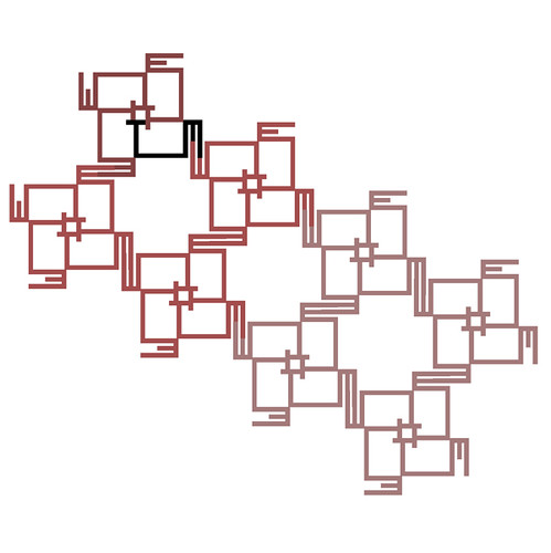
If we do this twice more, we have the new form below, made of 4 “4 modules”.  Let’s call it the “4 x 4 Module”:

now it turns out that the 4 x 4 Module can, itself, be repeated and plugged together as in the image below.  Let’s call this resulting new super-module the “4 x 4 x 4 Module”.

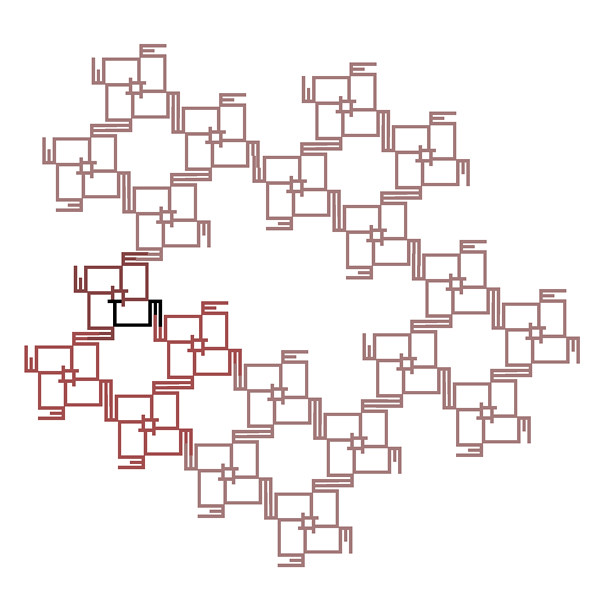
Now, here is the mystery. In the steps above, a “TIM” is multiplied by four to make the 4 Module.  The 4 Module is multiplied by four to make the 4 x 4 Module, which is multiplied by four to make the 4 x 4 x 4 Module.  It seems intuitive that there is a sequence in which, at each step, four modules combine into one super-module.  You’d think this would continue.  Li-Rong’s screen, upon which I based mine, works this way.

But look what happens next:  when you try to join four of the above 4 x 4-up modules into one super-module.  It take five modules to form this final module.  So we have the 5 x 4 x 4 x 4 Module.  Why?

Highly counter-intuitive.  Can anyone out there suggest why this happens?  Huge cash prize for the first successful answer submitted. There’s probably a simple explanation, but it escapes me.  I like the look of the screen though..

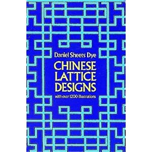
For more information on Chinese lattice designs (i.e. screens), I suggest  the “bible of Chinese lattice design”, Daniel Sheets Dye’s Chinese Lattice Designs (Harvard-Yenching Institute Monograph Series, 5-6.).  $13.10 on Amazon.  Better yet, buy me the book so I can study more of the fundamental forms of Chinese lattices — and maybe design a lattice for you.